By Mary Best
Editor-in-Chief
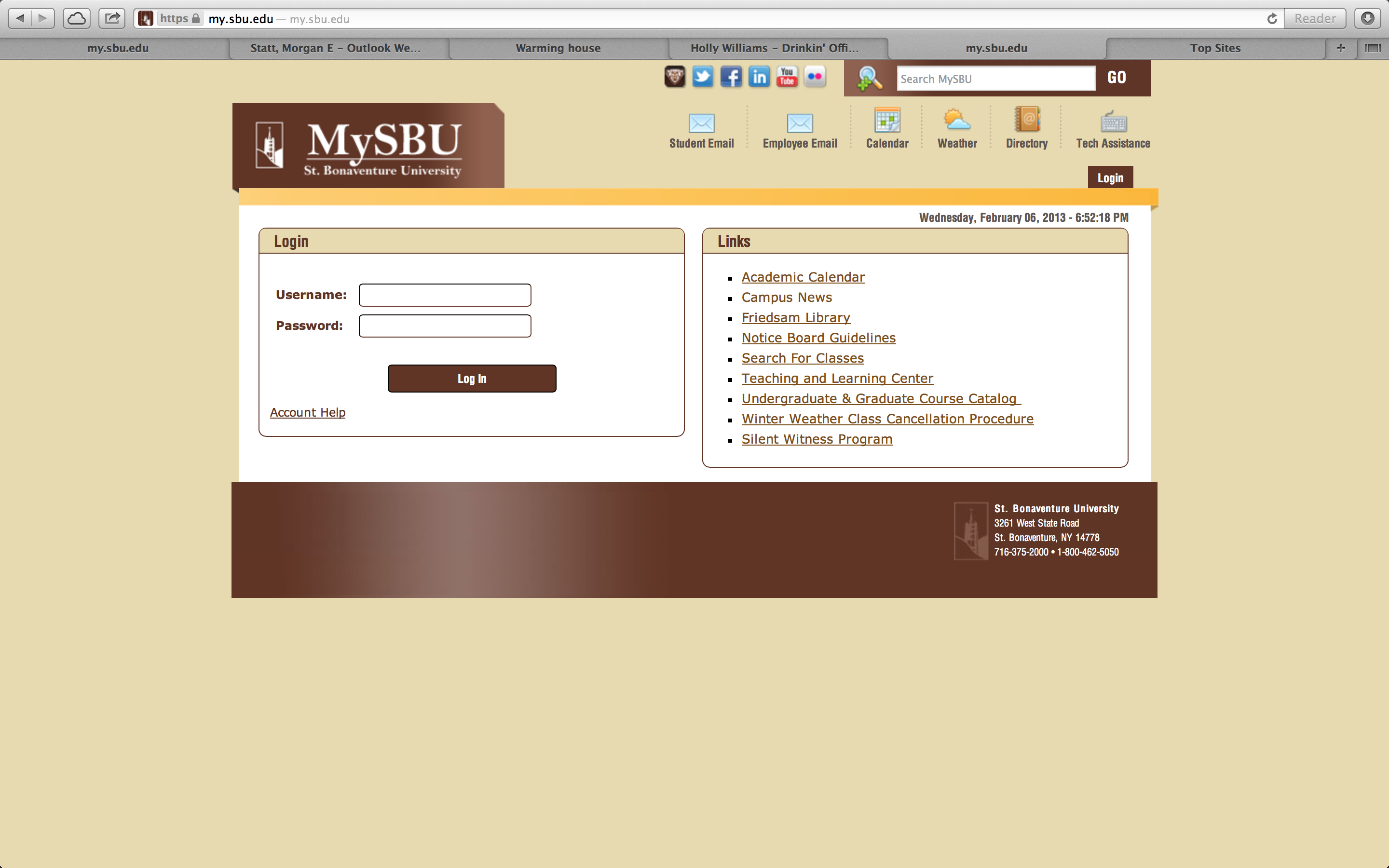
Bonaventure students received a belated winter holiday gift last week when Technology Services unveiled the all-new MySBU homepage.
The beloved hub for all things Bonaventure went under a much-needed makeover improving the overall appearance and functionality of the site, according to Michael Hoffman, executive director of information technology.
“The layout was changed along with navigation (options),” he said. We went from a side navigation to a tab navigation to make things easier to find. We did content boxes for the links and tried to chunk the content in a logical way as opposed to having a large list of links to allow people to find things easier.”
Hoffman also said they added a few new features to improve customization and overall practicality, including a search capability, quick link icons to email and a contact directory.
“It was probably 75 percent layout design project and 25 percent functionality project,” Hoffman said. “A lot of the content boxes also have lists of who to contact if you have a question or issue with anything in that content box.”
The new site debuted Jan. 31 after four months of planning and testing, which included a campus-wide beta test and survey.
“Fifty-two people filled out the feedback form, and out of those 52, 85 percent either agreed or strongly agreed that it was easier to find stuff,” he said. “We also had 86 percent of people agree or strongly agree it was an improvement over the old one.”
Of the 52 respondents, Hoffman said 46 percent were students, 37 percent were staff and 17 percent were faculty.
“It wasn’t huge numbers of people who responded, but we got some solid feedback and decided to go live with it,” he said.
While the old site seemed outdated, the changes displeased some students.
“It annoyed me because stuff that was in the student section in the last one moved,” said Amanda Tkaczow, a sophomore education major. “I had to go search for stuff.”
Chaelon Brennan, a sophomore accounting major, agreed even though the new site bears strong similarities to the old one, she had some trouble with finding things on the new site.
“It’s not really different from the original one, so I don’t have a big issue with it,” she said. “It is harder to navigate because you have to get used to where all the new links are.”
While other students also felt the navigation was hard to get used to, they liked the overall changes.
“At first it kind of freaked me out because I didn’t know where anything was, but it’s growing on me,” said Stephanie Boeher, a sophomore English major. “Everything, like the email, is more separate and more organized.”
Sophomore English major Julia Andretta agreed.
“I think it’s better organized. You don’t have to do much scrolling anymore,” Andretta said.
Junior sociology major Sarah Southwell likes the site’s overall cosmetic improvements the most.
“I had a little trouble finding the email the first time I was on it, but it seems more vibrant and less depressing to look at,” Southwell said.
With the positive survey feedback and overall improvements, Hoffman said he doesn’t think there is any chance of going back to the old MySBU. The remaining issues all involve underlying systems, such as those which power Moodle, Bonaventure email and class registration. Hoffman said he is limited in how much he can do to improve them.
“(MySBU) is really a clearing house for a lot of very complex systems. We’ve created hooks in the background so you don’t have to put your password in again,” he said. “There’s information that flows securely in between these systems to try and make them feel seamless, even though they’re not the same.”
While the trouble with third-party systems is not ideal, Hoffman hopes to improve them as he continues to update MySBU.
“If I was going to put a lot of effort into future improvements, I would try to do what I can to improve the experience of some of those underlying applications and not the front page of MySBU,” he said. “I think we’ve done a pretty good job of that.”

