I love sports. I love everything about sports. The competition, the adrenaline and the stories that unfold as we watch a season come down to the final few games always creates a buzz that lasts until the next season .One of my favorite things about sports is what the athletes wear. Uniforms are the trademark of a team. The logo is the face of an organization, and no sport utilizes that better than hockey.
Don’t get me wrong. I understand hockey is far from the most popular sport in America. I also understand that there are iconic logos and jerseys in every other professional sport. In MLB, you have the Yankees and their pinstripes. In the NBA, you have the Lakers’ classic yellow and purple, the Bulls’ red and the Celtics’ green. In the NFL, you don’t have to be a cheesehead to love the Packers’ green and yellow jerseys. And you may not like them, but no logo holds more weight than the Cowboys’ star. But no professional sport does jerseys and logos better than the National Hockey League.
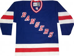
Hockey is the only sport where almost every team has its logo displayed proudly on its uniforms’ chest. The main exception to this is the New York Rangers, but their red, white and blue jersey with the word “Rangers” going diagonally across the front of the uniform is so steeped in tradition that no one cares. Jerseys automatically look better because there is more than just the name and number of a player on the jersey, but the team that he or she represents is better represented.
Hockey stays true to designs that work. Teams from the Original 6: The Rangers, the Boston Bruins, the Detroit Red Wings, the Montreal Canadiens the Chicago Blackhawks and the Toronto Maple Leafs, have all stayed true to their original designs since breaking into the NHL 100 years ago. Jerseys have been slightly modernized and logos have become cleaner, but the identity of those teams have never strayed far from their original look. And why would they? As much as it pains me to say this, because I despise half of those teams, and I am far from a fan of the other three, these teams have some of the best jerseys in the NHL.
But NHL jerseys continue to evolve as well, and as more teams entered the league, more and more great jerseys started gracing arenas across North America. Teams like the St. Louis Blues, the Washington Capitals and the Buffalo Sabres (I may have a slight bias in liking this team’s set) all have introduced incredible looks in to the NHL.
There is an entire website dedicated to designing new jerseys for NHL teams. Icethetics.co is about to hit its 10-year anniversary of being online. The website updates its followers about any rumors or possible changes coming to any jerseys or logos throughout the entire hockey realm. The website covers not only the NHL, but the AHL, the OHL, the WHL, the QMWHL, the ECHL, as well. There is also a concept page that anyone can submit a design to showcase. I am one of those people. I submitted two Buffalo Sabres jersey concepts that were both published on the website late last year. Now my designs have only received a 2.5/5-star rating to this point, but some of the comments were nice and it was cool to be on the website.
NHL jerseys are so good that there is an entire community out there, developing new ideas and designs for them. Jerseys are what set teams apart from their opponents and no one wants their team looking like a bunch of slobs. So, even though hockey is a sport of fights, cold rubber and big hairy toothless men, no pro sports league looks better than the NHL.
Dominic LoVallo is the Managing Editor for The Bona Venture. His email is lovalldv15@bonaventure.edu


